Let us show you just How to Lay Out your Design or Theme for your Snowmobile Club’s Website in a few easy steps. If you want to skim to the outlines and pictures, you’ll get the gist of it.
The design of a snowmobile clubs website is essential to driving people to what you club needs: More Members. As the new generations get paying jobs, families, and other big responsibilities, they are of course looking for a fun way to escape. Driving a groomer of course isn’t for everyone. But a monthly club meeting, spending a weekend clearing trees, chatting with land owners. That may just be a welcome diversion to peoples busy and hectic lives.
Let’s also not discredit the impact your public face, ie, your snowmobile club’s website has on land owners. Sure, maybe all the major landowners are in your club and have been important members. Yet, we all know how trails have been shut down do to 1 key part deciding to restrict access. This usually seems to happen when a new homeowner purchases the property, and when finding out there’s a trail on, shuts it down for a number of valid points as well as preconceived notions. Now don’t get me wrong, having an amazing website will never save you from that headache and heartbreak, but it may help sway the landowner in the right direction. Because, lets face it. The first thing they may do if on the fence is research who you are. If they can’t find it – why bother? If they’re not snowmobilers, they most likely would rather not deal with you on it. Plus, if you don’t exist on google and bing searches, chances are they do not think you are serious and growing. It is imperative they see an up to date page, with maybe even a Respect Our Landowners! type of image/except on your home page. Show them you keep your members informed, and give them a means to contact you (or better yet, post messages and alerts themselves). It can only help
Now, soap boxing aside. In our previous Advice article, we suggested what to do for a snowmobile clubs website in terms of hosting, domains, etc. If you are going to use ClubHosting to get you an out – of – the box website, many points suggested are already in place right out of the box. However, we still recommend reading through the article to avoid flubbing it too much
Lists are fun. Let’s start one shall we.
Here is what, as a rider, I feel every snowmobile club website needs
- Trail Maps
- Trail Conditions
- Upcoming Snowmobile Club Events
- Club Information
- Club Sponsors
- Registration information (club or events)
- Mailing List/Subscription option
Now – everyone may argue a little about the fine points. For example, some states rely heavily on the state associations. So they may choose to link to them for registration, etc. Some may have a highly active and unique source of revenue. However, many over reach and it ends badly. Either they make a hard to use site, so non technical people cant keep it updated. Or they add so much junk, people can’t navigate it easily. Worst of all, due to resources and experience, many can’t even offer an online club registration form!
Remember this When Laying our Your Club Website
- MAKE IT EASY TO NAVIGATE!
- Keep it uncluttered
- Keep it simple (for both visitors and admins)
- Make it short.
- Don’t Date Yourself
Now on to the fun part. Show and tell.
1) Make Your Club’s Site easy to navigate!
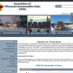
- Perfect example of too many links! 1
Ok, so it may have been a little, just a little obnoxious to show this associations snowmobile themed website. However, due to the highly number of poor websites, I grabbed one off the front page of a google search and took some screenshots.

- yep, the menu still is going and not done, but who needs to see more?
The other thing you should consider to add is breadcrumbs. Not from your lunch time snack, but think hansel and gretel. Breadcrumbs are links that show people what errant path they took to wind up on the page. Or more importantly, how to find other useful information. Example ClubHosting > Support and Advice > How To’s > Design a Snowmobile Club Website …if you wanted to see more articles from us, you could check out our other support and advice pages.
2) Keep your Club Website Uncluttered!
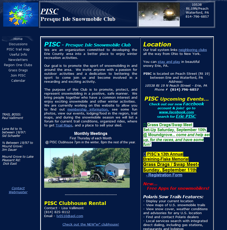
Now let’s be fair. PISC looks like they are a good club. I would join them, and they are giving it a full effort. However the above example is a combination of lack of tools and venturing in the realm of what they don’t know. Had they, ahem, chose to use clubhosting as their engine, they could have avoided the need to make updates to their page in microsoft word, and use a yellow highlighter to post important events.
I really do feel bad throwing them under the shoulda-coulda-woulda bus, but this snowmobile site is hard to navigate. Based on the amount of space. Their swap meet is a driving force of revenue, if this is not the case, it should have a much smaller space. They may generate a fair amount from referring riders to stay at specific hotels, but that is tiny. You have a simple menu on the left, yet the landing page is scatterbrained. It should ultimately have latest news, maybe an about us, but that should be it. Widgets on the right if you must, but not massive amounts of text or bullets.
However, the biggest thing hurting them is white text on blue background. No one wants to read that folks. Yes, you may love blue. However, lets take a queue from Google, Facebook, MSN, and others. No one wants to see text over a dark background. You can use color to highlight your headings, or frame. Or even color code your statuses or alerts (if viewing a list that is), but keep it simple.
3) Keeping your Clubs Theme and Design Simple
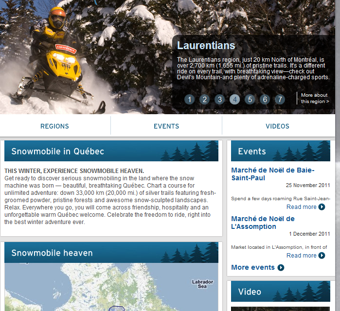
- one language per page please
We understand. You have to have things in two languages due to your demographic. However, I have no idea what the hell is going on. I have english chosen, yet your widgets are loading in french Senior Snowmobile in Quebec website. The above is a clean site. They have well thought out navigation. However where they failed to keep it simple was their language script. Which renders the site utterly useless for my uneducated American self who isn’t fluid in french.
Many sites fall into that rut. They have so many ideas that they start making before analyzing and wind up backed into a corner trying to make things compatible. The above is a coding bug, however, browse other peoples club websites. You will notice the same issues.
4) Good Example: Keeping It Brief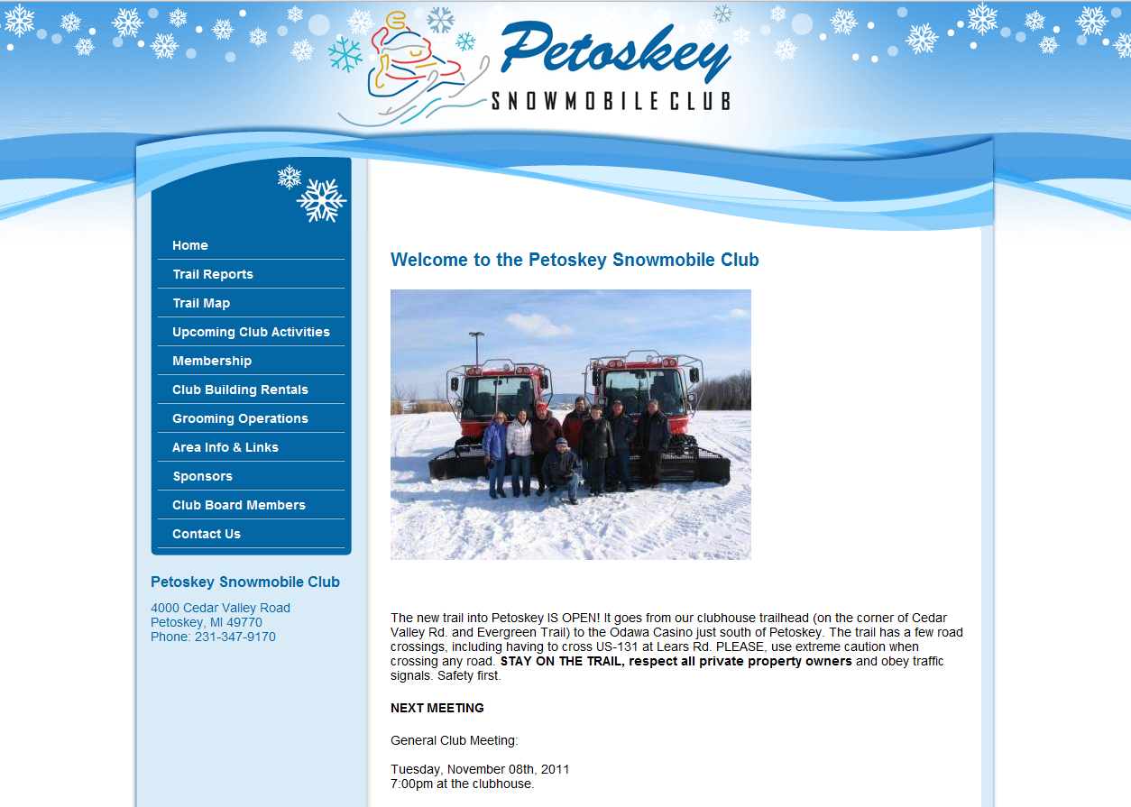
If you are making it this far down, you are wishing I followed my own advice. Yet you are not here for a trail update. Keep your site info brief. Add more tags to your posts, and keep the heading succinct. Use excerpts on your main pages and side bars for events, don’t list all features. If you do that, you overpower your content, and ultimately, people wont read it. If you can remember just how lazy people are, you will do yourself a favor. Don’t take it wrong. They want to know about events, but they all don’t want to read each bullet point.
The Petoesky snowmobile club site (above) has a sheer elegance to it. It is utterly simple, yet it doesn’t look cheap. They have a short menu on the side. They don’t ramble on their landing page. They have enough information and visitors to keep them well ranked and listed.
I can’t sprinkle complete praise on them though. The biggest area I found lacking were their sponsors. They should be linking and helping increased the value of their sponsor’s contributions.
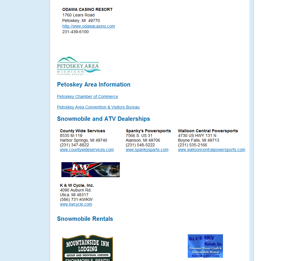
They started off so well, but it kind of got away from them. They would have been better served ditching the logos and doing Rows of alike Sponsors. If your sponsors demand graphics be placed, either make them smaller or make them pay a little more. Yes, the Mountainside Inn sign will help remind people on the trails that it their in, but really, if you help them Book, so will their payment of a few hundred dollars. Forget about the ‘branding’
5) Keeping It Current
You have enough info from us to know what this is about. Use something simple to keep your site updated. Ie, our system or some other content manager. Otherwise you will end up with this gem:
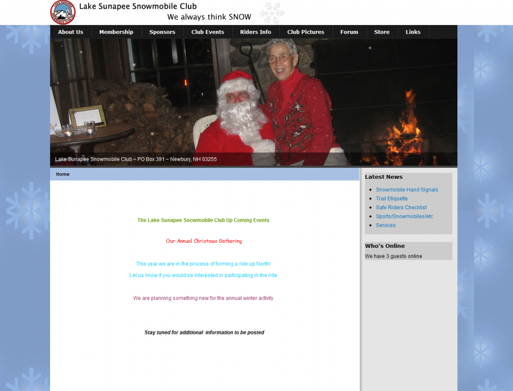
Think the above would encourage some 29 yr old to join? No, and they even have a clean layout and easy navigation thanks to what appears to be a well known content management system.
But 5 colors of text?
Old people on eachother’s laps?
I got a youthful acronym for you all – WTF?
Good luck designing your theme and layout for your snowmobile club website. Hope this was of help!
We have more videos and demos of our services in use. Many clubhosting websites were laid out by us, so feel free to browse google for sites using clubhosting as a search term. It won’t show all, but some.
